Wednesday 9 December 2015

Cottage GAME TEXTURE DEVELOPMENT

When I got the cottage the UV's were already done so i just had to get the snapshots.

I had to get all of the UV snapshots so that I could create the textures that I would later put onto the cottage. So I started off with making a folder for all of the snapshots I was going to get, so the first snapshot I got was the Roof snapshot, then I got all of the walls both top and bottom of them, then I got all of the pillars and then I got the window from the roof and began to organise them into an order of which i would texture first.

The roof was very simple to texture as I just had to get a simple patterned texture that was fairly dark as I wanted a darker roof for my cottage and when i'd finished the roof texture and applied it the roof looked good and worked well so didn't need any changes.

The walls were a little more tricky I had to put a plank texture for the window frame so it looked nicer and i had to match all of them up to look right and when i'd done that I added the same texture I used for my door on the side of the walls and left the windows plain so I could do another thing with them later.


The pillars are the same pillars that are used on the door so I just applied the same texture that i used on the door for the pillars and it worked extremely well, I also made it look nice and work well with the walls so it gave a nice contrast.

The roof window was simple I just had to apply the wood texture from the walls to the outside of the window and for the frame I simply used the plank texture again and matched it up to look proper and nice. I still left the window blank so I could finish it later with the rest.

I thought the incandescence map would be a lot harder then it actually was it was just the texture map without any texture and a pure black background. However where the windows are on the texture there needed to be a yellow block so that you could see the window on the map in Maya. After i'd done this I went into Maya and under the Incandescence map slot I added my map and to my surprise it worked perfectly first time.

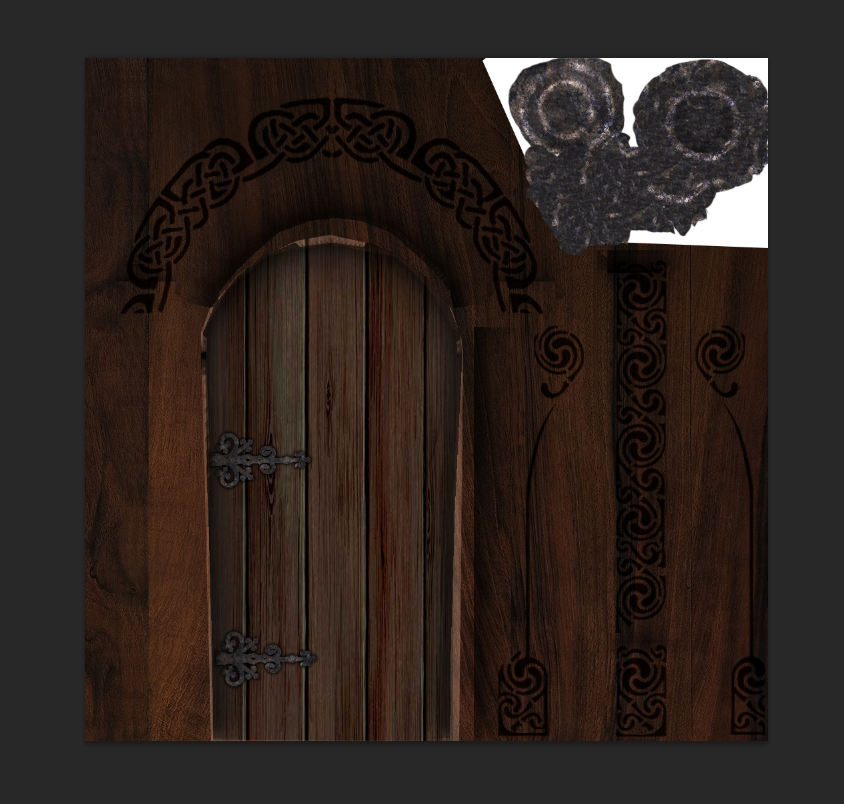
The door was really simple and didn't require anything really, I just had to apply the same texture I had already fully textured to the door that was already on the cottage model as they were the same door.

I then added a bunch of celtic patterns to the areas I wanted them and how to go back and alter them a bunch in photoshop because they didn't look how I wanted them to on the model.

After I had done all of this and put it all together I had finished my cottage.


Door GAME TEXTURE DEVELOPMENT

I started off with my door models with the UV's already done so I went into my transfer map sub menu and set up my baking options so I could bake my door. I had to tick the Ignore Mirrored Faces box so that it would ignore the overlapping faces in the UV map.

Instead of making a full AO map I instead made a cavity map in Xnormal due to the fact it gave sufficient shadow information that was needed. This is done in the same way my AO map was done but instead of ticking the Ambient Occlusion box you have to click the Cavity map box.

Then I had to put my cavity map into photoshop to texture. I started off texturing the door frame and pillar once i'd done that I textured the door with a different wood texture and made it darker so it added a better effect in Maya.

I then found a nice celtic pattern I liked on the internet and added it to the texture and turned the layer fx to inner shadow so it added a better effect to the texture.

I then applied a stone texture to the door handle and found some fancy looking hinges to apply to my texture to give it better detail and gave the hinges the same stone pattern as the handle so it gives it a much better effect.

The normal map had to be assembled in a different way, I had to get the base wood texture and apply a surface blur and copy and paste it to overlay and add a more detailed look to the wood. As soon as i thought the amount of detail I wanted was there I stopped doing the process.

After I had done all of this I applied all of my textures to the door and just had to go back to make the wood look better an have the grain go the right way and once I'd fixed that issue I had finished and saved my door.


Spell Book GAME TEXTURE DEVELOPMENT

Modelling of the Book

I started off just searching for images that I could use for my spell books texture, I first thought of the texture that I would want the cover of my book to be so I found 3 old leather textures that I could use, I then found metal for the lock and rust to go on top of the metal to give the spell book an older look.

After I built my photo library for the texturing of my spell book I began to model my spell book. I started out with a fairly simple idea of how I wanted to model my spell book, so I started with a cube and made it the size I wanted my spell book to be then I used the insert edge loop tool and put 3 new edge loops in so the I could move the faces in where I wanted the pages of my book to be. so I now had my pages and my book cover but the cover had no shape to it really so I beveled the edges of the spine of my books cover and then moved the faces around until they had the angle I wanted them to have and it gave my spell book a bit of a less rigid shape.

I then created a new cube so I could model my lock for my spell book. All I did to model the lock in the shape I wanted it to be in was creating a rectangular shaped cube and then I used the edge loop tool on the top and bottom of the rectangle so I could extrude the 2 new faces I had and make a C shape but the C shape was too rigid and had sharp corners so I beveled the corners and it gave it more of a lock shape instead of a rigid shape. I then moved my lock into the right position on my spell book and adjusted the shape to make the lock fit correctly and look in proportion to the rest of the book because if it was too big or too small it wouldn't look right and it would look as though it could do the job it was intended to do on the book.

Texturing of the Book

Before i could texture the book I had to UV map it in Maya and I did this by planar mapping the model in Maya and then opening the UV texture editor and organising my UV's so that I knew what was where and it would make my life much easier when it came to actually texturing my model in photoshop. I then took a UV snapshot and saved the Snapshot in a file that i could easily remember and access so that I could find it when it cam to texturing in photoshop.


When I put my UV snapshot int photoshop I had already made a folder with all of the textures I wanted to use in it so that I wouldn't have to spend time looking for nice textures to use I had them all ready to go as soon as I needed them.
I began to apply my wanted textures to the UV spaces in photoshop so that when I put the completed texture map back into Maya i first applied the leather texture to where my Book cover was on my UV snapshot then i added the Page texture to where the pages were on the snapshot but had to make sure that they looked right in Maya and didn't look incorrect otherwise my texture wouldn't be serving its proper purpose, then I added the metal texture to the locks place and turned off the layer that had my UV snapshot on so the lines didn't appear on my models texture, i then saved my texture map and went back into Maya added a new material to my model and went into the attribute editor and added my texture that I had created. I then looked at my model and liked the texture so I saved it as my finished spell book.


High Poly Crate GAME TEXTURE DEVELOPMENT

High Poly Crate

First off I had to planar map the entire crate so that I could texture and make all of the required maps for this model. When I had planar mapped the cube I had to sort out my UV's in the UV texture editor so I could easily texture it in photoshop.

I then had to go into the rendering mode in Maya, then open the Transfer Maps tab under the lighting/shading sub menu, once you've opened it your going to want to put your low poly object into the target mesh slot and the high poly mesh in the source mesh, select envelope change the output map to normal and change the file format to a targa or tga format, then go into the Maya common output menu and change the map height and width to 1024 x 1024 and put the sampling quality on high, then bake it.

Once I had done this I went into Xnormal and put my high and low poly snapshots, then went into baking options and ticked Ambient Occlusion also then I clicked the box next to it and open the options menu, I had to change the Rays up to 200, then i baked my AO map.

After this I put the AO map into Maya and added a worn looking metal texture over the top of my AO map, I then proceeded to make the worn texture look even more work in the places where it should look worn such as the handles and screw holes. After this I added colour to the map where I wanted the colour to be so it adds more effect and looks better.
Then I added rust and more worn features to my near to complete AO map and made the colours blend into the overall map.

I then made a specular map by turning the overall brightness level down for my worn texture and then I went into the colour range to sample the dark grey in my texture and add it to a new layer so that the chips can be white, then I made them brighter with the levels tools.

I then added all of these different maps into Maya and on to my model and it looked nice first time so I didn't have to go back and change anything so I saved it as my finished cube so I could find it when I needed it.


Alien Head GAME TEXTURE DEVELOPMENT

I started off with the Zbrush file without anything on it as a basic head and started to plan out what I would texture in what order and what colours I would need to implement on to the head to make it look how I wanted it to.

I had to paint my model when I'd decided on what I wanted the colour of it to be and even though it may look hard its really simple and actually quite fun to paint a model in zbrush I really enjoyed using this program.

I started off texturing the head and neck of my alien and at first I didn't like the colour I was using so I went through a few iterations of different colours and finally settled on my purplish colour. I wanted to add detail to the neck that made it stand out so i added yellow splotches making it look more alien like, I also made the top of it's head as though you could see it's skull on top which gave it a nice effect, I added darker shades to areas that would be a darker colour and I made it look right in my eyes and how I wanted it.


The eyes weren't hard to do at all I just added a base blue colour and drew on the black cat like eyes that I knew I wanted for my model. Although while working on the eyes I realised I hadn't defined any eyebrow type things so I did that and made a darker effect around the eyes.


The teeth were done in 2 parts the top and bottom set and I added my base colour that I wanted them to be then added a dark version of that colour where the gums would be to add a nice looking effect and then I made the tips whiter so it gave off the illusion that my alien had sharp teeth


The spine wasn't hard when I decided that I wanted to give it that metal look so it looked more like an alien and gave the effect I had wanted it too.


After I had fully textured my model I used a cavity mask to bring out the more in depth details in my model by using a darker iteration of the colour I had original used. This gave a great effect and I'm glad I decided to use it.

Now the poly-painting was done I exported the head, eyes and teeth as .OBJ's. Using X-Normals I could use the head I had painted in Z-Brush as a high poly mesh to apply to the low poly one provided for us within Maya. The vertex colours can be read by X-Normals to generate a diffuse map, as well as the program being able to generate a normal and ambient occlusion map from the mesh. I overlayed the ambient occlusion map onto the diffuse in Photoshop by setting the layer to multiply, this brought out much more depth in the colour. I was also able to create a specular map from the diffuse by making it black and white, turning down the brightness and upping the contrast. Now I had all the maps I imported the meshes for the head and eyes into Marmoset and applied them accordingly in order to achieve a high quality render not possible within Maya.

These are my Final Renders


Thursday 22 October 2015

Photo Manipulation GAME TEXTURE DEVELOPMENT

Photo Manipulation

My starting image
After collecting a large amount of pictures from the internet in the previous lesson and creating a photo library I have started creating my Photoshop picture today. I started with a photo of Washington DC and throughout the lesson I edited the picture and added other pictures to give the overall image the look and feel that I wanted it to have at the end of its creation.

My end goal for this image that we were set to create was to create my idea of how hell would look if it was in Washington DC so I focused on giving the image a darker and more over the top feel so that people wouldn't get confused when they see the photo and they would understand that it was Hell in my image.

I started by removing the sky with the magic wand tool and then in place of the old sky adding a very dark red sky with a numerous amount of clouds in it so that when you were to look at it you got an idea that it wasn't calm and more hectic then it normally would look. Next I wanted to add a few comets but when I added them they didn't feel blurred enough so I added another comet over the top of the first one and blurred them together by using the blending options and blending the too together which gave the comet a nicer feel and blend then it previously had and it made it look more realistic with the sky instead of just looking as though it had been plopped into the picture and not a nice fit in the photo.

The birds were fairly easy to implement into my edit as they didn't require much editing, I did however change some of the features about the birds, first of all they had a blue outline as they were taken from a photo with a blue sky so I had to go around each bird individually and make it so there wasn't a stand out blue outline around each bird, before I did this however I cropped some birds out and only kept a certain number so they wouldn't look overly clustered and would look a bit more natural. After I had completed the editing of the birds and implemented them into my edit I had to choose where to place them and I chose to place them just flying in front of the building because it felt as though it fit in with the panic of the overall edit.

I added fire into my photo manipulation so that it would give the overall image of more of a hellish scene instead of being so plain and looking as though it was just the building with a red sky backdrop. so I started with just adding the fire but it didn't fit the image as well as I wanted it to so I had to change the brightness and contrast so that the fire didn't stick out like a sore thumb and look like it completely didn't belong in the photo, I also adjusted the levels so that it would darken the whole piece of fire and give it the same darkness as the rest of the photo and make it look as though it was on the grass in the first place and not just added in, this required the grass and fire to be at the same darkness which they weren't before I adjusted the levels of the fire. When I had completely changed the fire so it was at the right level and contrast I duplicated the fire and then copied my brightness and contrast as well as my levels so I knew that the fire would look right and be as dark as I needed it to be.

The car was added as more of a last second thing to make the scene look a bit more hectic and to give the viewer of the photo of feeling as though this place was very chaotic and not normal. To get the car that I wanted I had to put the car photo into Photoshop and edit out all of the background that was in the background of the car's original image and this wasn't very hard to do at all I just put the car image onto a new layer because without a new layer when I deleted the unwanted background of the car I would've been deleting other parts of my manipulated photo, So when it was on a new layer and fully edited so it didn't have any unwanted parts I implemented it into the manipulated photo and positioned it where I thought it fit the best.

I added a dark red gradient to my manipulated photo, I did this because before I had added the gradient the building was to white it felt as though it was glowing and it didn't fit in the photo at all as its supposed to be a dark and chaotic photo instead without the gradient it didn't look like that at all. So the gradient that I added was positioned to go up from the bottom and by that I mean start really dark at the bottom and progressively get lighter as it went up the grass and building eventually fading into the sky. Its like this so that the building and grass have an overall darker colouring to them and look more evil and chaotic to fit with the overall theme of the photo.
My finished photo manipulation.